Overview
2021 Fall
On March 11, 2020, the World Health Organization (WHO)’s declaration of COVID-19 as a pandemic caused widespread panic and alarm across the United States. One of the biggest shocks about the results of the pandemic was that the U.S. fared worse than other countries, “with more than 29 million cases and nearly 530,000 deaths” (Scientific American). As a result, there is an urgent need to understand the mistakes that were made which led to where we are today. This study is referenced on both Pittsburgh Post Gazette and NPR.
Research Questions
We explore a variety of research question, each about the effectiveness of mask mandates at the state-level in the United States.
-
How varied was mask mandate policy at the state-level?
-
How long does it take after a mask mandate intervention to see an impact on COVID cases?
-
Does effectiveness of mask mandates vary by season?
-
Mask Mandates in the Delta Wave
-
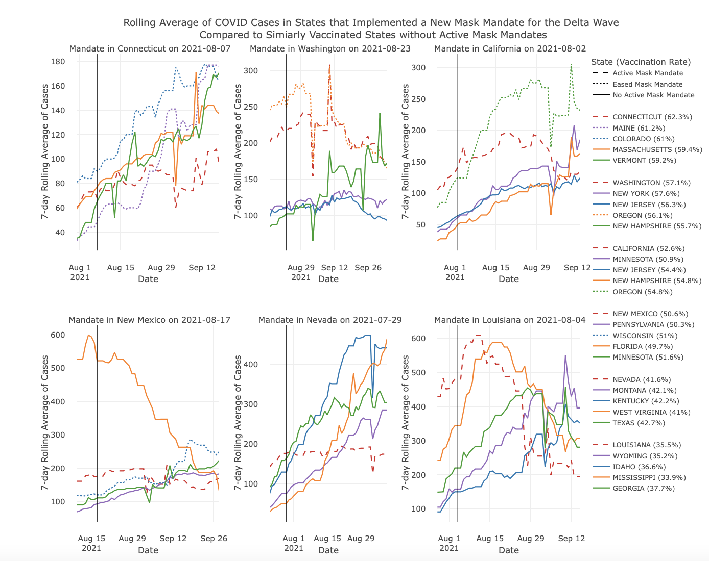
Were mask mandates in the Delta Wave effective?
-
How does vaccination rate interact with mask mandate effectiveness?
Full Interactive Report
Main Takeaways
1. Coorelation != Causation
This may seem very obvious. However, the reality is we only have observational data but we want to draw a causal conclusion. What we end up doing is trying to account for confounding factors. One example is the graph my colleague Jimmy made where he compare the effectiveness of masks between states with similar vaccine rates. Even though we couldn’t account for every possible confound factor, we try to address the major and impactful ones.
2. Interactive Graphs is a Saver
Graphs are good ways to visualize data but if it contains too much information then it becomes overwhelming. Interactive graphs are a balance between the two – it allows the readers to easily get the gist but also open to inspect individual data points in depth.
3. Data Reports are Subject to Manipulation
In our research, we try out best to maintain objectivity. However, we can clearly see that it’s very easy for the researcher to manipulate the analysis so that they can see the results they want: e.g. using different success criteria, comparator, or calculation methods. In an academic research paper, this may be very apparent, but in a corporate setting where the people only skim the conclusion and the graph, it leaves a lot of room for manipulation. Hence, it’s advisable for PMs to understand how the data analysis is conducted to ensure it’s not intentionally or accidentally manipulated.
Under the Hood
We utilized R with various packages including tidyverse, ggplot2, and plotly.